Group 11 Workshop 2

Climate change and temperature anomalies
weather <-
  read_csv("https://data.giss.nasa.gov/gistemp/tabledata_v4/NH.Ts+dSST.csv",
           skip = 1,
           na = "***")
Select the year and the twelve month variables from the weather dataset and convert the dataframe from wide to ‘long’ format.
#Converting into long format, first column (year) stays
weather_selected <- weather %>%
  select(1:13)

tidyweather <- weather_selected %>%
  pivot_longer(cols = 2:13,
               names_to = "month",
               values_to = "delta")

tidyweather
## # A tibble: 1,716 × 3
## Year month delta
## <dbl> <chr> <dbl>
## 1 1880 Jan -0.36
## 2 1880 Feb -0.5
## 3 1880 Mar -0.23
## 4 1880 Apr -0.29
## 5 1880 May -0.06
## 6 1880 Jun -0.16
## 7 1880 Jul -0.17
## 8 1880 Aug -0.25
## 9 1880 Sep -0.22
## 10 1880 Oct -0.3
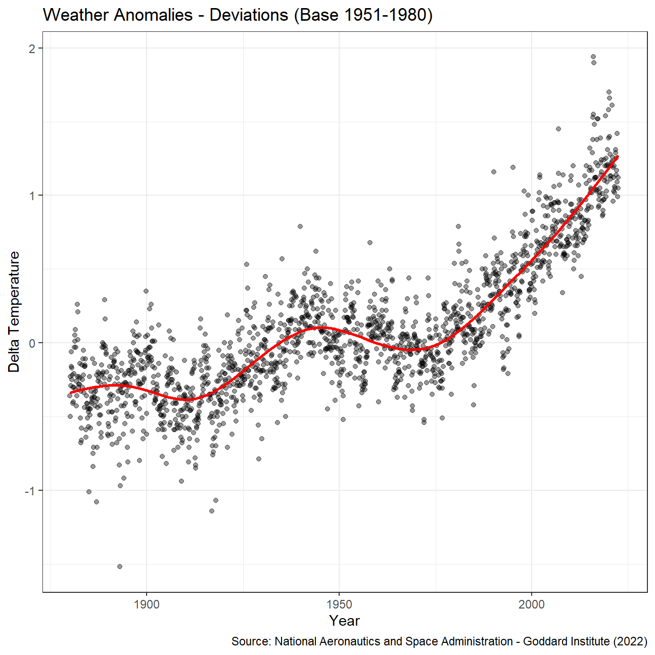
## # … with 1,706 more rowsLet us plot the data using a time-series scatter plot, and add a trendline.
# Transforming the date
tidyweather <- tidyweather %>%
  mutate(date = ymd(paste(as.character(Year), month, "1")),
         month = month(date, label=TRUE))

# Creating scatterplot
ggplot(tidyweather, aes(x=date, y = delta))+
  geom_point(alpha = 0.4)+
  geom_smooth(color="red", se = FALSE) +
  theme_bw() +
  labs (
    title = "Weather Anomalies - Deviations (Base 1951-1980)",
    x = "Year",
    y = "Delta Temperature",
    caption = "Source: National Aeronautics and Space Administration - Goddard Institute (2022)"
  )
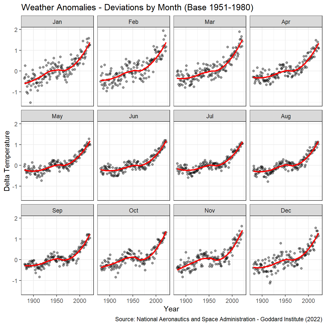
Is the effect of increasing temperature more pronounced in some months?
Answer:
It looks like the colder months (Oct to April) have increased more significantly (steeper slope) than the summer months. This can also be confirmed by a report from the US Environmental Protection Agency which highlights that overally, minimum temperatures have increased at a higher rate than average maximum temperatures.
We remove data before 1800 and before using filter. Then, we use the mutate function to create a new variable interval which contains information on which period each observation belongs to. We can assign the different periods using case_when().
# Code provided, creating new column for intervals with case_when function
comparison <- tidyweather %>%
  filter(Year>= 1881) %>%     #remove years prior to 1881
  #create new variable 'interval', and assign values based on criteria below:
  mutate(interval = case_when(
    Year %in% c(1881:1920) ~ "1881-1920",
    Year %in% c(1921:1950) ~ "1921-1950",
    Year %in% c(1951:1980) ~ "1951-1980",
    Year %in% c(1981:2010) ~ "1981-2010",
    TRUE ~ "2011-present"
  ))
Create a density plot to study the distribution of monthly deviations (delta), grouped by the different time periods we are interested in.
# Different density courves in same figure
ggplot(comparison, aes(x = delta, fill = interval)) +
  geom_density(alpha = 0.5)+
  labs (
    title = "Weather Anomalies - Deviations by Period (Base 1951-1980)",
    x = "Delta Temperature",
    y = "Density",
    caption = "Source: National Aeronautics and Space Administration - Goddard Institute (2022)"
  ) +
  theme_bw()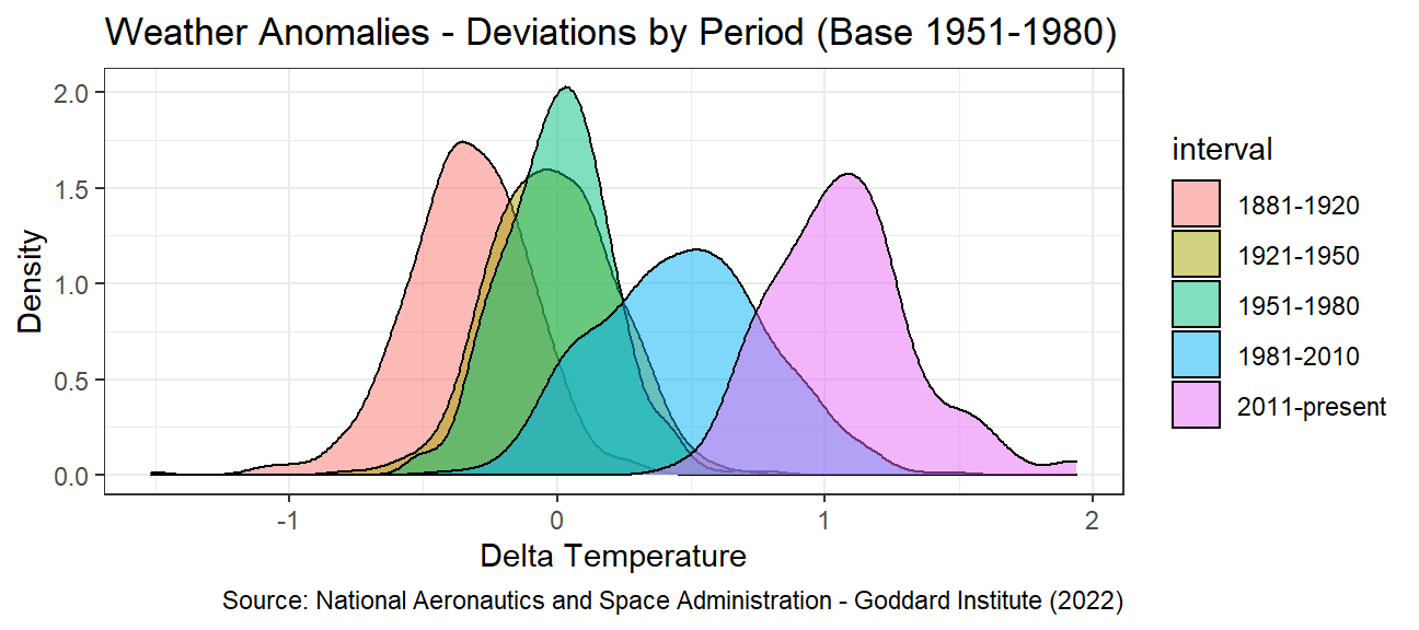
Create a scatter plot for average annual anomalies.
#creating yearly averages
average_annual_anomaly <- tidyweather %>%
  group_by(Year) %>%   #grouping data by Year

  # creating summaries for mean delta
  # use `na.rm=TRUE` to eliminate NA (not available) values
  summarise(meanDelta = mean(delta, na.rm=TRUE))

#plotting the data:

ggplot(average_annual_anomaly, aes(x = Year, y = meanDelta)) +
  geom_point()+
  #Fit the best fit line, using LOESS method
  geom_smooth(method="loess", colour="red", se = FALSE)+
  labs (
    title = "Weather Anomalies - Deviations annual mean (Base 1951-1980)",
    x = "Year",
    y = "Delta Temperature",
    caption = "Source: National Aeronautics and Space Administration - Goddard Institute (2022)"
  ) +
  #change theme to theme_bw() to have white background + black frame around plot
  theme_bw()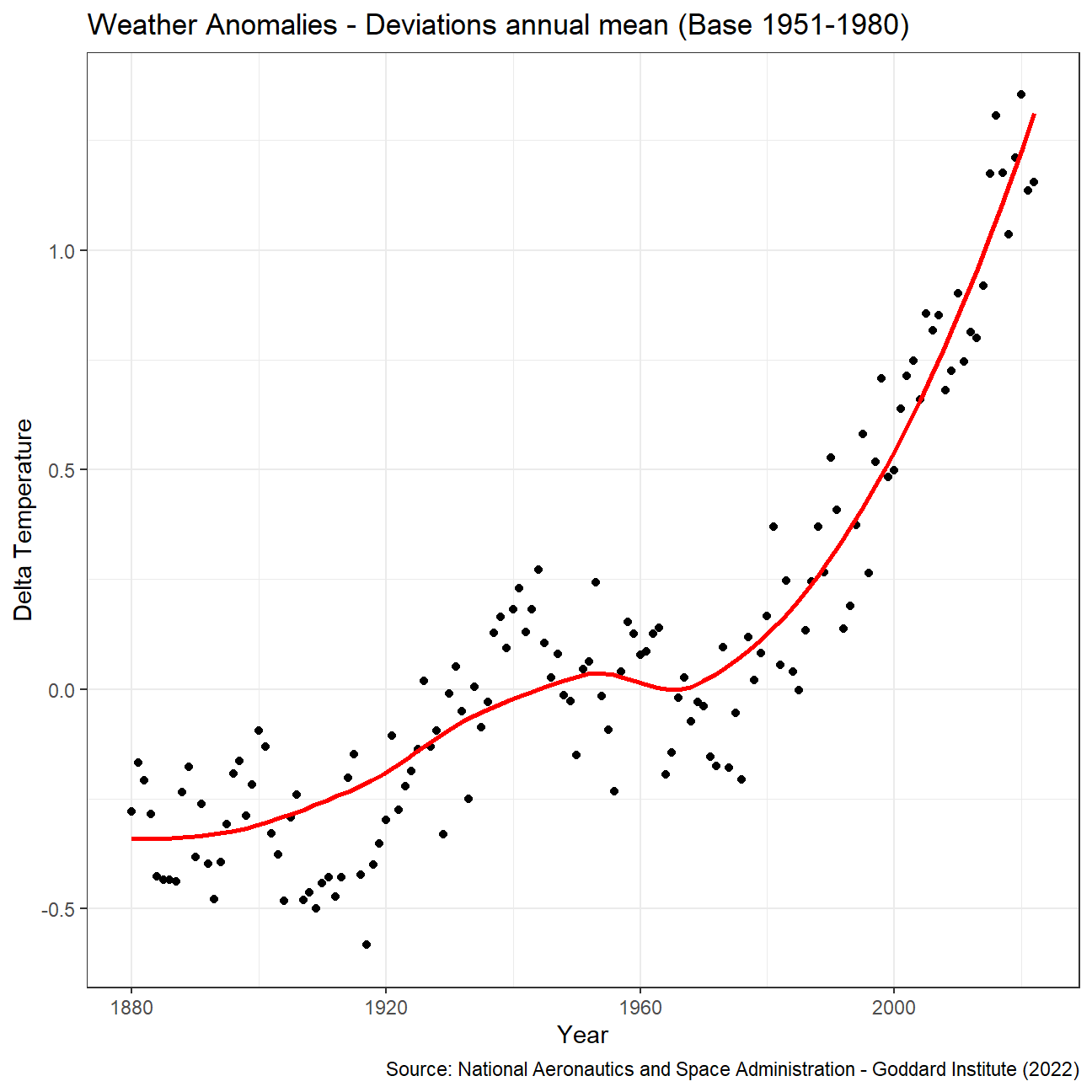
Confidence Interval for delta
# Using formula approach for CI
formula_ci <- comparison %>%
  # choose the interval 2011-present
  filter(interval == "2011-present") %>%
  group_by(interval) %>%

  # calculate summary statistics for temperature deviation (delta)
  # calculate mean, SD, count, SE, lower/upper 95% CI
  summarize(mean = mean(delta, na.rm=TRUE),
            sd = sd(delta, na.rm=TRUE),
            count = n(),
            t_critical = qt(0.975, count-1),
            se_delta = sd/sqrt(count),
            margin_of_error = t_critical * se_delta,
            delta_low = mean - margin_of_error,
            delta_high = mean + margin_of_error)
#print out CI
kable(formula_ci,
caption = "CI by Formula")| interval | mean | sd | count | t_critical | se_delta | margin_of_error | delta_low | delta_high |
|---|---|---|---|---|---|---|---|---|
| 2011-present | 1.07 | 0.266 | 144 | 1.98 | 0.022 | 0.044 | 1.02 | 1.11 |
# Using bootstrap (infer package) approach for CI
set.seed(1234)

boot_delta <- comparison %>%
  filter(interval == "2011-present") %>%
  specify(response = delta) %>%
  generate(reps = 1000, type = "bootstrap") %>%
  calculate(stat="mean")

bootstrap_ci <- boot_delta %>%
  get_confidence_interval(level =0.95, type = "percentile")

#print out CI
kable(bootstrap_ci,
caption = "CI by Bootstrapping")| lower_ci | upper_ci |
|---|---|
| 1.02 | 1.11 |
Answer:
We started by calculating the lower and upper boundary with the formula. This is done by using the t-distribution available in R (qt) and multiplying it with the standard error. The bootstrap simulation on the other hand creates 1000 repetitions out of the given data (delta in this case) and uses the get_confidence_interval function from the infer package to create the delta_low and delta_high value. First of all it can be said that with 1000 iterations, the bootstrap simulation yields the exact same results as the formula. Further the count (144) allows to have a low t_critical as well as a small standard error, producing a quite narrow confidence interval.
Biden’s Approval Margins
# Import approval polls data directly off fivethirtyeight website
approval_polllist <- read_csv('https://projects.fivethirtyeight.com/biden-approval-data/approval_polllist.csv')
Lubridate the chr dates
# Use `lubridate` to fix dates, as they are given as characters.

approval_date <- approval_polllist %>%
  mutate(enddate = mdy(enddate))
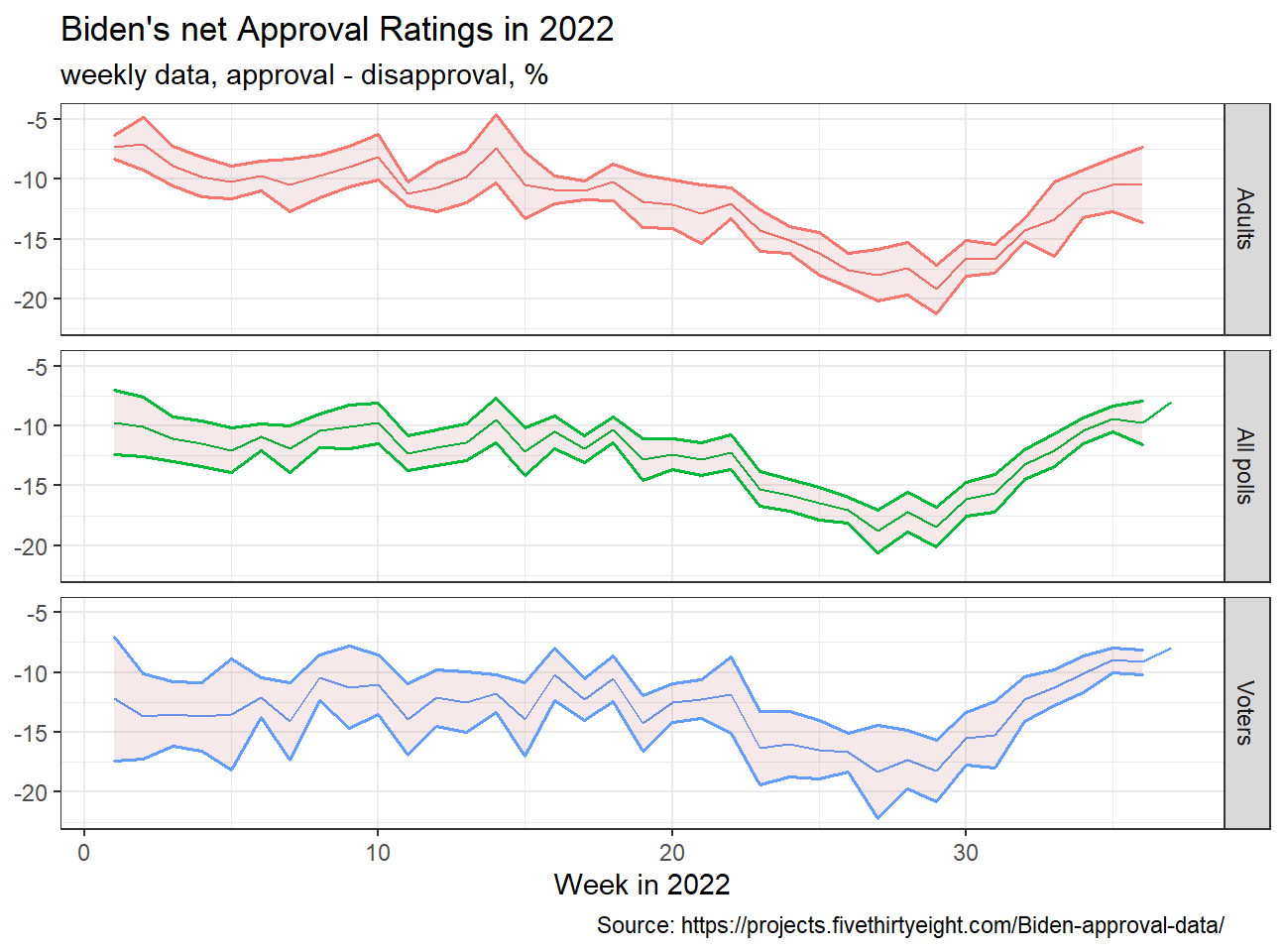
Create a plot for net approval rating for each week in 2022
# Filtering data for year and interested columns
poll_filtered <- approval_date %>%
  select(c("enddate","subgroup","approve","disapprove")) %>%
  filter(enddate >= "2022-01-01") %>%
  mutate(week = week(enddate),
         dif = approve-disapprove)

# Calculating ci for each subgroup and week
ci_biden_facet <- poll_filtered %>%
  group_by(week, subgroup) %>%
  summarize(mean = mean(dif, na.rm=TRUE),
            sd = sd(dif, na.rm=TRUE),
            count = n(),
            t_critical = qt(0.975, count-1),
            se_diff = sd/sqrt(count),
            margin_of_error = t_critical * se_diff,
            diff_low = mean - margin_of_error,
            diff_high = mean + margin_of_error)

# Plotting line chart with ribbon function for CI
ggplot(ci_biden_facet, aes(x = week, y = mean, color = subgroup)) +
  geom_line() +
  geom_ribbon(aes(x=week, y=mean, ymax=diff_high, ymin=diff_low, color = subgroup), linetype=1, size = 0.7, fill = "brown", alpha=0.1)+
  facet_wrap(~subgroup, ncol = 1, strip.position="right") +
  labs(
    title = "Biden's net Approval Ratings in 2022",
    subtitle = "weekly data, approval - disapproval, %",
    y = NULL,
    x = "Week in 2022",
    caption = "Source: https://projects.fivethirtyeight.com/Biden-approval-data/"
  ) +
  theme_bw() +
  theme(legend.position="none")